Text 위젯은 플러터에서 가장 많이 사용하는 위젯으로 화면에 문자열을 보여주는 위젯
Style : Text 위젯에 스타일 적용
- letterspacing : 글자 간격 조정
- wordspacing : 단어 사이 간격 조정
- shadows : 그림자 효과
- decoration :텍스트 꾸미기
- TextDirection : 텍스트 정렬 방향
- Overflow : 텍스트 오버플로우
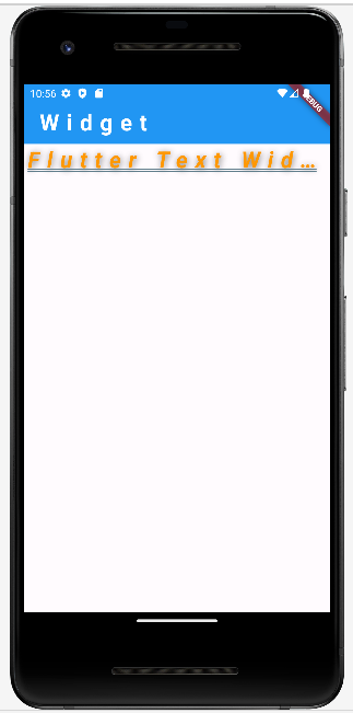
decoration
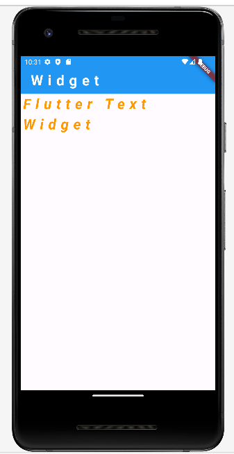
child: const Text(
    'Flutter Text Widget',
    style: TextStyle(
      color: Colors.orange,
      fontWeight: FontWeight.bold,
      fontStyle: FontStyle.italic,
      fontSize: 30.0,
      letterSpacing: 10.0
    ),
),
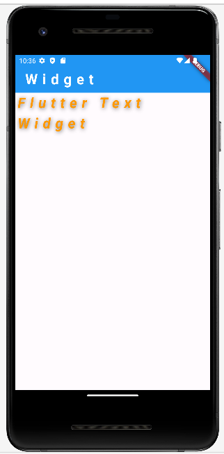
shadow
style: TextStyle(
  color: Colors.orange,
  fontWeight: FontWeight.bold,
  fontStyle: FontStyle.italic,
  fontSize: 30.0,
  letterSpacing: 10.0,
  shadows: [
    Shadow(
      color: Colors.black54, // 그림자 색상
      offset: Offset(1,2),   // 그림자 오프셋
      blurRadius: 20,         // 그림자 크기(퍼지는 정도)
    )
  ]
),
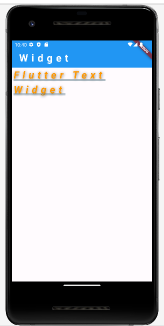
decoration
.
.
.
생략

decoration: TextDecoration.underline,
decorationColor: Colors.blueGrey,
decorationStyle: TextDecorationStyle.double,
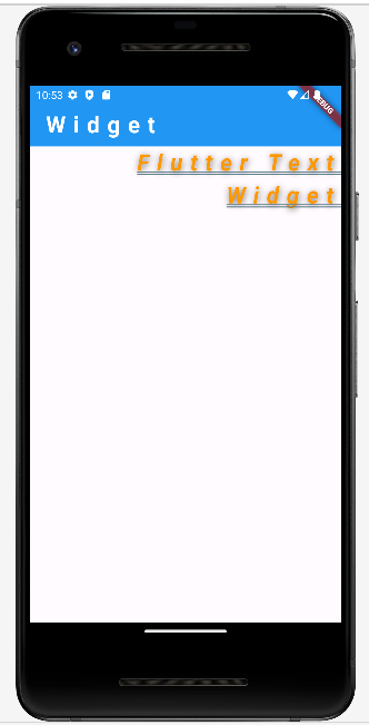
TextDirection
'Flutter Text Widget',
textDirection: TextDirection.rtl, // 왼쪽에서 오른쪽 정렬
maxLines: 1,
overflow: TextOverflow.ellipsis, // 한줄이 넘어가는 텍스트는 ...으로 표시

ellipsis : ... 표시
fade : 하단을 흐리게 표시
clip : 한줄에 보여질 수 있는 문자열만 출력
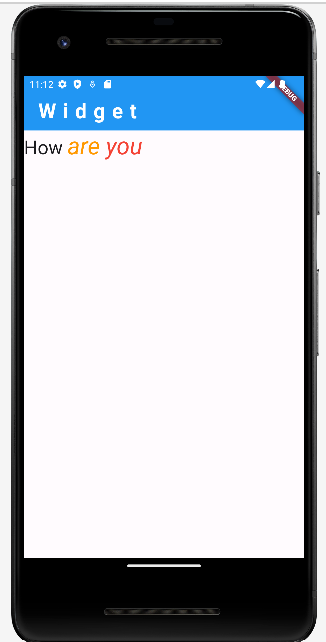
Text.rich(고급 텍스트 스타일) : 여러 텍스트로 나눠서 스타일을 각각 적용할 수 있다.
Text.rich(
  TextSpan(
    text: 'How ',
    style: Theme.of(context).textTheme.headline4,
    children: <TextSpan> [
      TextSpan(
        text: 'are ',
        style: TextStyle(
          fontSize: 35,
          fontStyle: FontStyle.italic, color: Colors.orange,
        ),
      ),
      TextSpan(
        text: 'you ',
        style: TextStyle(
          fontSize: 35,
          fontStyle: FontStyle.italic, color: Colors.red,
        ),
      ),
    ],
  ),
),
'Mobile > Flutter' 카테고리의 다른 글
| (Flutter) SafeArea (0) | 2024.04.28 |
|---|---|
| (Flutter) Image / Icon (0) | 2024.04.28 |
| (flutter) BoxDecoration (0) | 2024.04.23 |
| (Flutter) margin / padding (0) | 2024.04.23 |
| (Flutter) Container (0) | 2024.03.21 |